Towards a Better Way: The “Vignelli” Map at 50

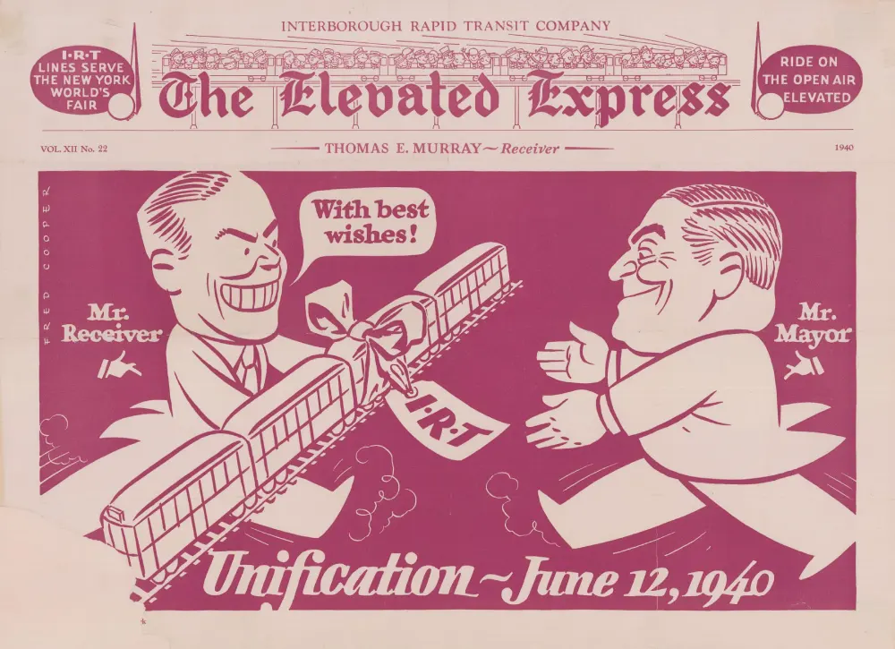
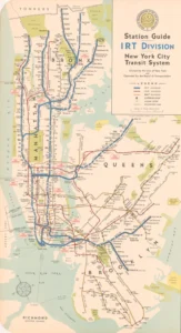
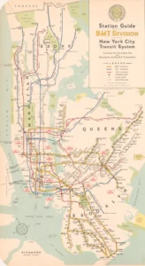
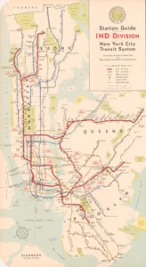
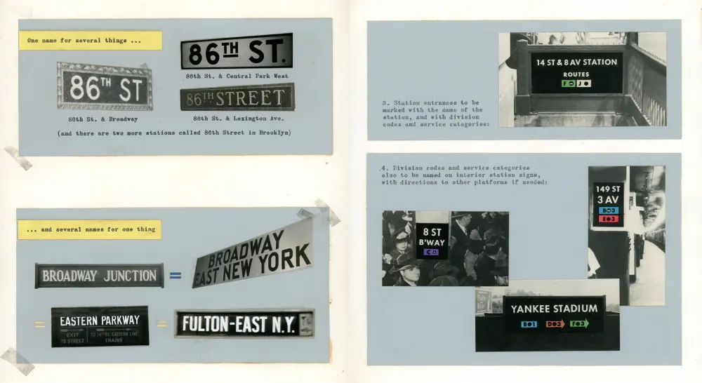
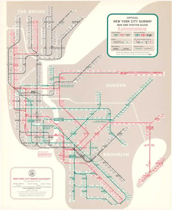
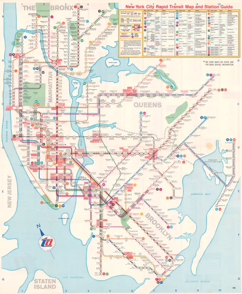
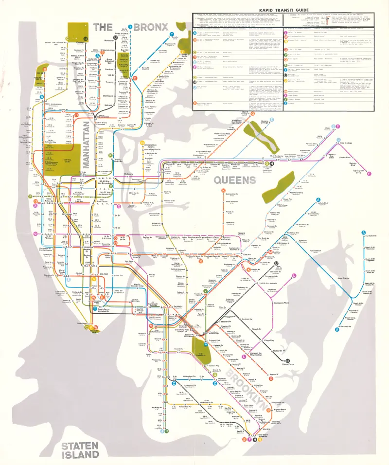
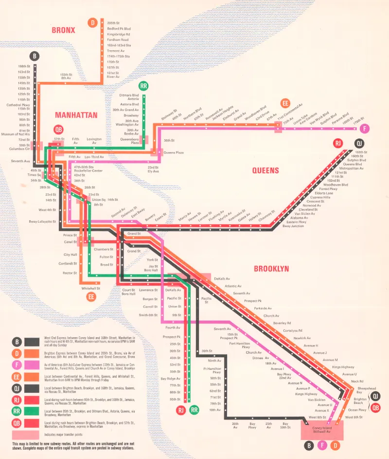
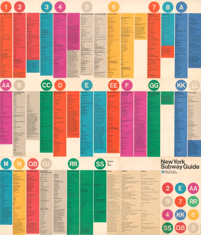
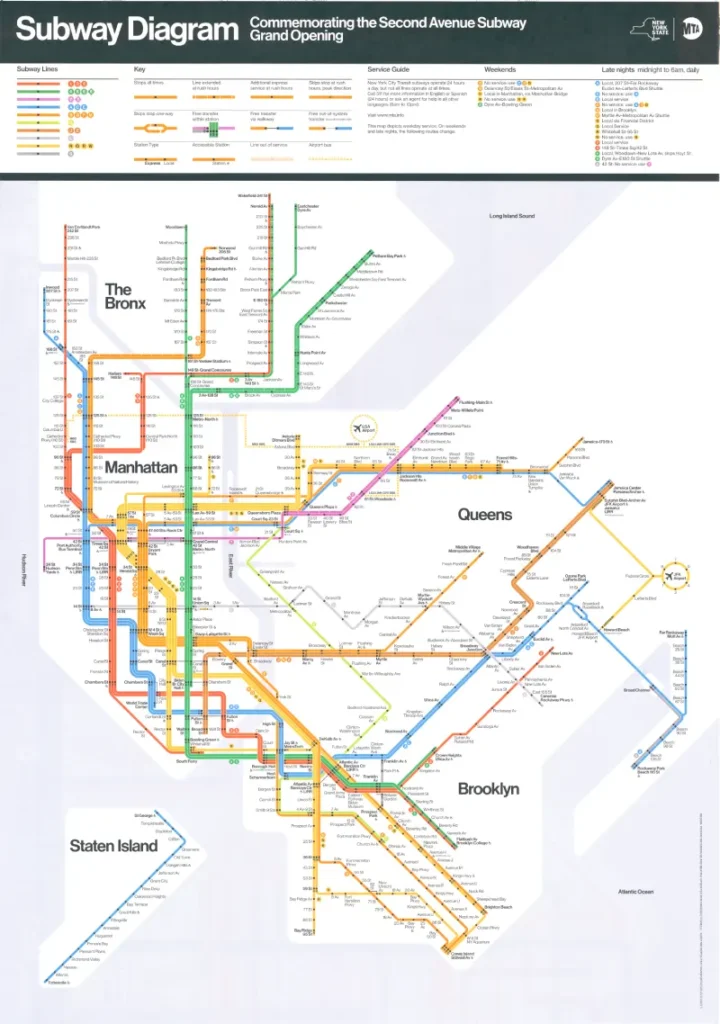
In August of 1972, the New York City Transit Authority (NYCTA) debuted a colorful diagrammatic map of the subway system, now commonly referred to as the Vignelli Map. It was the first map published by the Authority designed by an established design firm. It also incorporated several design ideas into one map that had not been combined before including a service diagram drawn with straight lines instead of curved ones, and the absence of any details that did not convey information to customers. The most obvious stylistic change was to remove the majority of New York’s topography, making most of its boundaries defined by bodies of water. The firm that designed this map was Unimark International. Its principals, Bob Noorda and Massimo Vignelli, as well as other designers including Joan Charysyn, changed the way New Yorkers thought about (and navigated) the subway forever.


New York’s subway system was originally three separate companies: the Interborough Rapid Transit Company (IRT), the Brooklyn-Manhattan Transit Company (BMT), and the City-owned Independent Subway System (IND). In 1940, all three companies were unified under City control. Though they were officially one entity on paper, the physical integrations between the former IRT — today’s numbered lines — and the BMT and IND — today’s lettered lines — progressed slowly through the mid-1960s. The pace and challenges of subway unification had an instant and lingering impact on wayfinding information left over from the previous three-company era.

Although maps had depicted the unified system since 1940, the first cohesive effort to standardize the wayfinding and informational signage NYCTA inherited from numerous predecessor agencies began in 1966. The authority hired Unimark International, who devised a set of standards for station signage as well as the way information was imparted to customers. One of the most important aspects of this new direction was reimagining the subway map.

Three 1948 station guides, one for each predecessor agency. Although the subway system was unified in 1940, New Yorkers were still using the IRT/BMT/IND parlance well into the 1980s.


Towards a Better Way

“The subway system has now reached a point where only an expert can find his way around it.” – George Salomon, 1957

“Unless there is a compelling reason, other than tradition, to perpetuate the present method of using only three colors to designate the various subway lines of this city, this method should no longer be followed.” – Raleigh D’Adamo, 1964

Lexington Ave–59 Street, 1968, 2005.48.285, NYCTA Photograph Unit Collection, New York Transit Museum.

After unification in 1940, the subway system was filled with layers of informational signage from various time periods and transit companies. Platform to mezzanine staircases, such as this one, were especially crowded.

The slow streamlining of passenger-facing information led to serious research into wayfinding and information delivery by the Transit Authority itself and inspired interested parties outside of the agency such as George Salomon, Stanley P. Goldstein, and Raleigh D’Adamo.


George Salomon, 1957; Courtesy of Frank Salomon.


George Salomon (1920 – 1981), a graphic designer, sent an unsolicited proposal, called Out of the Labyrinth, to the Transit Authority in 1957. It outlined several of the issues that had arisen from three transit companies — with three separate identities — merging to become one. He offered steps to make this unified system easier to comprehend for city natives and tourists alike.

Excerpts from Out of the Labyrinth, by George Salomon, 1956 – 57; New York Transit Museum Collection. Excerpts from Out of the Labyrinth, by George Salomon, 1956 – 57; New York Transit Museum Collection.

Excerpts from Out of the Labyrinth, by George Salomon, 1956 – 57; New York Transit Museum Collection.


Official New York City Map and Guide, 1958, 2004.19.65; New York Transit Museum Collection.

Some of Salomon’s thinking was applied to a system map, first issued in 1958 and used well into the 1960s. It was New York’s first subway map to use a Beckian grid (named for Harry Beck, the draftsman who standardized the London Underground map with 45 and 90 degree angles), which resulted in a clearer and more useful travel aid. Salomon’s map was also the first New York subway map to be produced directly by the Transit Authority and not a third party.


Raleigh D’Adamo (b. 1931), a Brooklyn native, was practicing law when he entered — and won — a 1964 contest to improve New York City’s subway map. D’Adamo transitioned from the legal field to his passion: transportation planning and improvement. D’Adamo held positions in the MTA as well as the administration of New York City Mayor John V. Lindsay, and in 1975 was named Transportation Commissioner of Westchester County.

Stanley P. Goldstein (b. 1934) was a professor of Engineering at Hofstra University when he published his 1965 study Methods of Improved Subway Information. The report included suggestions similar to the ones made by Salomon and D’Adamo. These included color choices, the typeface used for signage, and identification of train routes.


New York City Rapid Transit Map and Station Guide, 1967, 1996.1002.8; New York Transit Museum Map Collection.

Combining the ideas behind Salomon’s 1958 map, changes in subway service that would affect the entire system in one way or another, and a need to include more information on the map than ever before, a new map was designed in 1967 that was based on the collective thinking of Raleigh D’Adamo, Stanley Goldstein, Jerome Adler, and Dante Calise of Diamond National, a printing company used by the Authority. The map’s creation, spearheaded by Leonard Ingalls (the NYCTA’s first Director of Public Information and Community Relations), was part of an agency-wide initiative to integrate information delivery.This map, with revisions, remained in use until the 1972 introduction of the Unimark-designed map.

On October 30, 1970, D’Adamo — then Assistant Administrator of the Transportation Administration of New York City — submitted a report entitled Simplified Subway Routings: Key to Better Transit in New York City. The report was an argument for deinterlining parts of the subway system, which meant having more discrete subway routes. Accompanying the report were two maps which represented what the system could look like if this occurred, with both existing and proposed routes from 1968’s Program for Action expansion plan. The design for these maps was based on the 1967 – 1969 version designed by D’Adamo, Goldstein, Adler, and Calise and introduced a nomenclature that seems completely alien to subway riders of today: all lettered. These maps were created independently of the Unimark map, despite being produced in the same time frame.


“A More Attractive, and Readable Subway Map”

“The Authority desires to develop a more attractive, and readable subway map to assist its passengers in traveling on the rapid transit lines of the New York City Transit System; and the Consultant has had considerable experience in the preparation and design of directional materials…” – contract between the New York City Transit Authority and Unimark International, 1970

“The Metropolitan Transportation Authority displayed a new series of subway maps yesterday in an attempt to untangle a system that on paper often looks as confusing as a mass of spaghetti.” – The New York Times, August 5, 1972

“You want to go from Point A to Point B, period. The only thing you are interested in is the spaghetti.” – Massimo Vignelli, 2006

In 1970 the New York City Transit Authority hired Unimark to redesign the subway map, based on the work they had done to standardize wayfinding and signage for the Authority in the late 1960s.

New Subway Routes, 1967; New York Transit Museum Richard Carpenter Collection

This 1967 diagram outlining the new routes brought about by the opening of the Chrystie Street Connection — tunnels that connect former BMT and IND services in lower Manhattan — was not designed by Unimark but does look similar stylistically to what they would deliver in 1972.

It incorporates some of the firm’s design thinking, such as the routes being straightened into lines and dots representing stations at regular intervals (not in geographically accurate distances). It also exhibits characteristics from Goldstein’s 1965 report, such as “no dot, no stop”, and the way transfer stations are depicted.


New York Subway Guide, 1972; New York Transit Museum Collection

The Unimark map made its debut in August 1972. The “pocket map” version of the design, produced for customers to take with them, featured a system diagram, a key, and a simplified list of subway services on one side…

New York Subway Guide, 1972; New York Transit Museum Collection

…and a detailed breakdown of services on the verso, including stops, times, and special notes, such as rush hour services. The colors and service designations had already been introduced in 1967, as part of the Chrystie Street Connection project.

This is one of two designs of the “pocket map”, with subway “bullets” on the cover. According to Peter Lloyd’s 2012 book Vignelli Transit Maps, the bullet design originated with the New York City Transit Authority, and not Unimark.

After Unimark designed the map, it was handed off to the NYCTA, who made changes as needed until 1976, when Michael Hertz Associates was named “caretaker”, making changes as needed.

Details of 1972 map; New York Transit Museum Collection
Details of 1974 map; New York Transit Museum Collection

The first major revision of the map in 1974 entailed some service-related and geographical changes. The biggest change, however, was a subtle one: the switch from Helvetica Medium for station names to Trade Gothic.

One interesting aspect of the map is the distinction between IRT, BMT, and IND services. Even though New York’s subway had been unified in 1940, New Yorkers were still using this parlance well into the 1980s. These designations disappeared from maps for good when Unimark’s map was supplanted.

New York Subway Guide, 1978; New York Transit Museum Ben Chiaro Collection

The Unimark map went through a series of changes over the next few years. Many were service-related, but some were for legibility. By the last version in 1978, several routes had been changed or eliminated outright, such as the K and the 8, as had some geographic aspects.

For various reasons, beginning in 1975 when the Subway Map Committee was formed, the NYCTA sought to move away from the Unimark map and reintroduce a more geographically based one. The Committee was chaired by John Tauranac and included several people who had already been heavily involved with the map’s design over the years, including Dr. Arline Bronzaft, Steven Dobrow, and Michael Hertz.

In 1979 they succeeded. A new subway map, designed by Michael Hertz Associates, debuted in time for the subway’s Diamond Jubilee, and versions of that map have been the prevailing standard ever since.

Second Avenue Subway Grand Opening Diagram, 2017; New York Transit Museum Map Collection

Despite its absence from everyday use, the subway map Vignelli and his cohorts designed was hailed as a “design classic”. Joan Charysyn applied her design work on the subway map to the MTA’s commuter rail map in 1974, making it a stylistic companion. In 2008, Vignelli Associates was commissioned to redesign the map for Men’s Vogue. Vignelli worked closely with two designers in his firm, Beatriz Cifuentes-Caballero and Yoshiki Waterhouse.

That commission led to the development of the digital “Weekender” map, which in turn led to the diagrammatic map used to inaugurate the opening of the Second Avenue Subway in 2017.